Empowering Data Navigation
Prompted by user feedback highlighting pain points and low usage rates on our client’s main dashboard, our team initiated a strategic overhaul. The primary goal was to boost user engagement by empowering them with greater control, customization capabilities, and clearer data insights.
Recognizing the critical role the dashboard played in decision-making, our focus zeroed in on enhancing functionality and user-friendliness to address these specific pain points.
Audit, Craft, Iterate
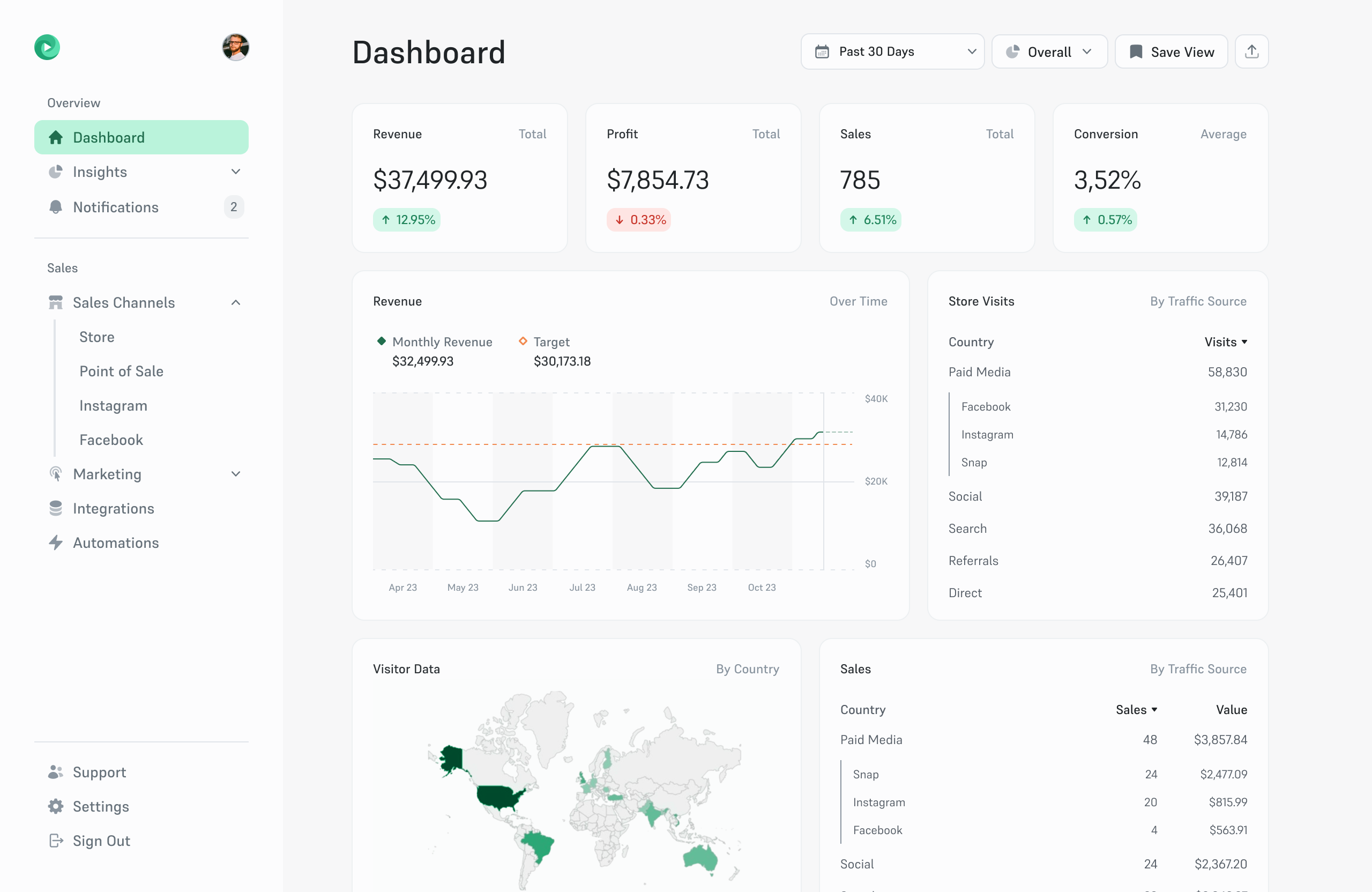
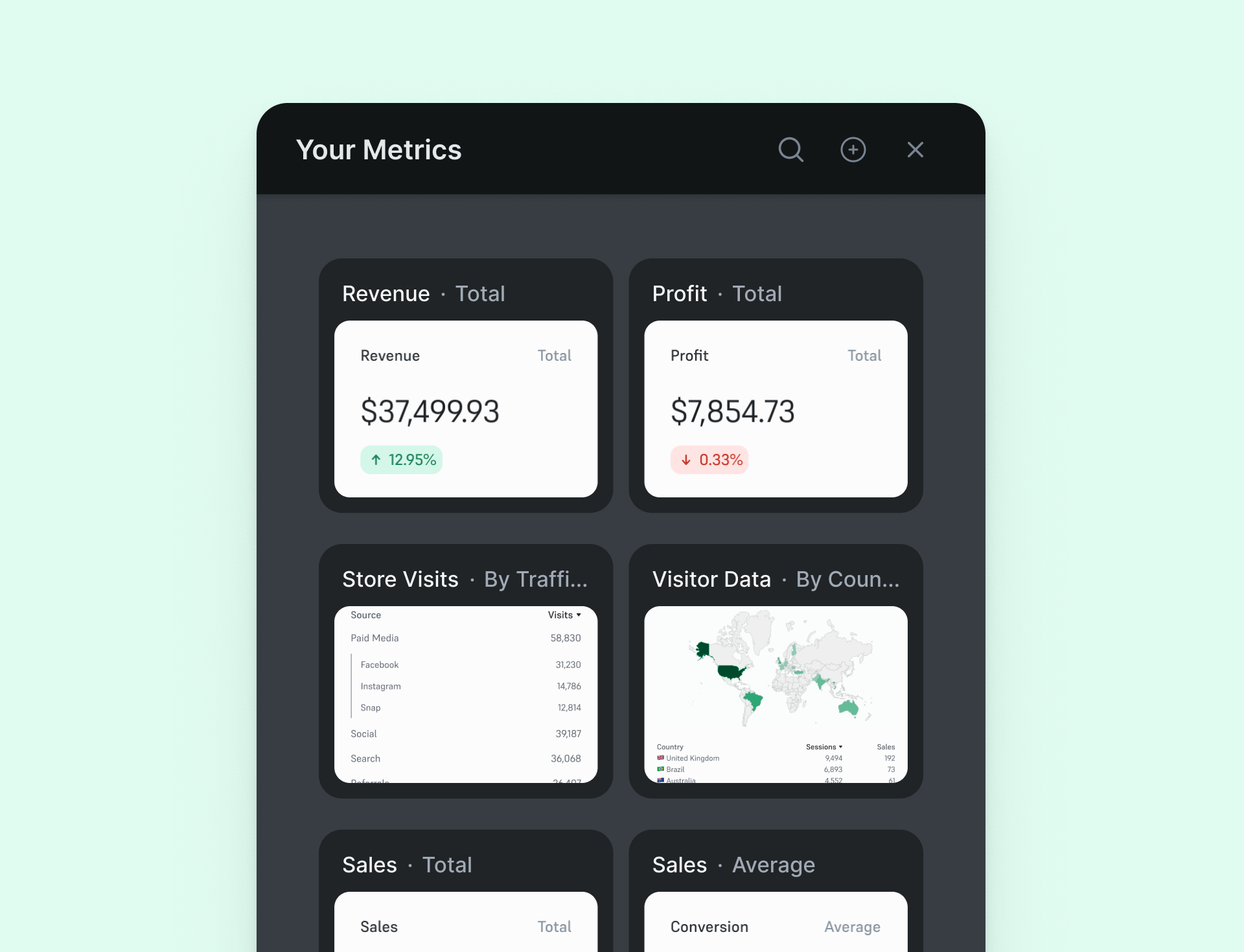
Conducting a meticulous audit revealed significant opportunities for improvement in the existing layout. We recognized the need for clearer data groupings and a more intuitive navigation structure. Through collaborative design iterations, we revamped the layout, prioritizing clarity and user-centric groupings.
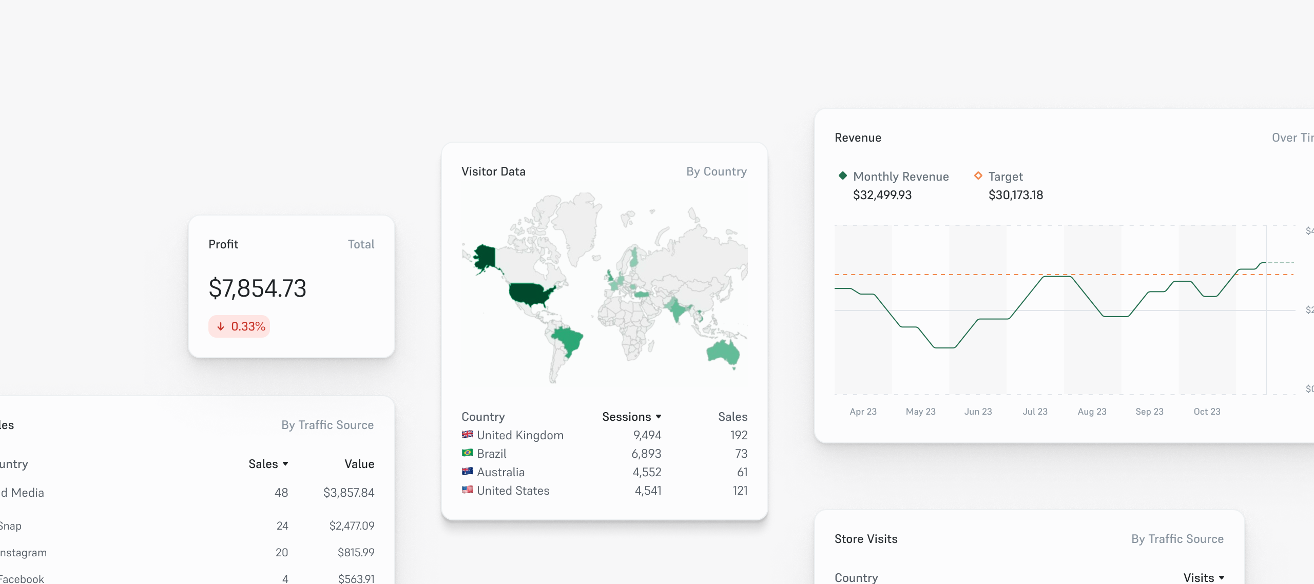
A pivotal addition was the introduction of personalized “Views.” This feature empowered users to curate and save tailored data sets, enabling seamless transitions between critical insights such as revenue analytics, store traffic metrics, and campaign performance data.
Enhanced Freedom
Recognizing the importance of user autonomy, we aimed to provide unprecedented flexibility in dashboard customization. Our team implemented an intuitive system that allowed effortless movement of dashboard sections.
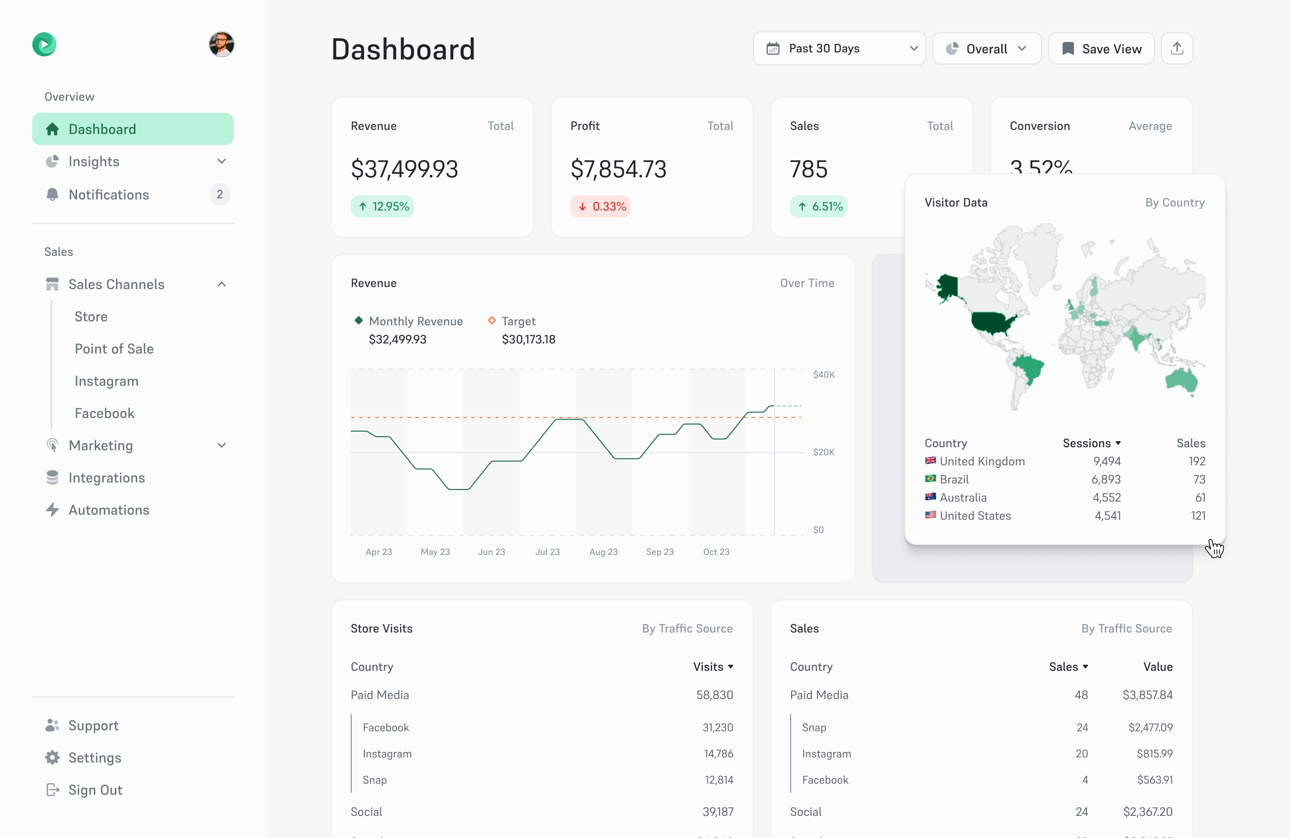
This innovation granted users the freedom to craft their personalized data landscape, positioning metrics and insights according to their specific needs and preferences. Sections would move in response to the user input, and could be resized dynamically to make space for a more optimal layout for that specific user.
Breaking Down Breakdowns
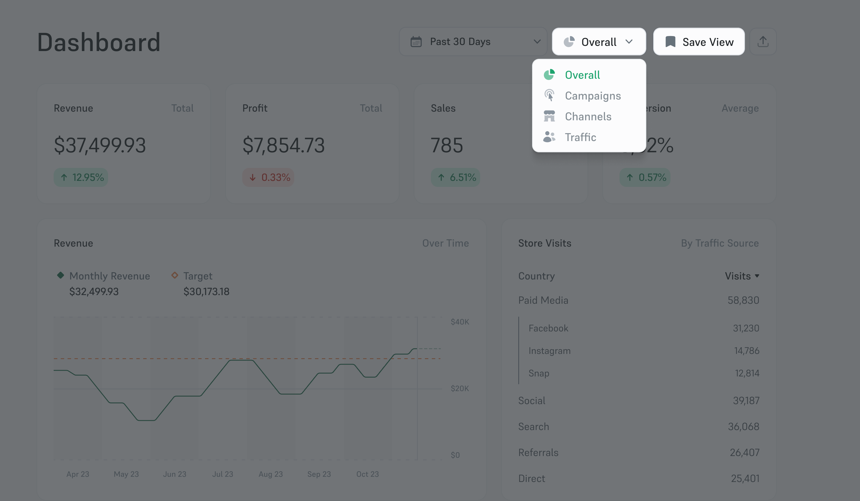
Understanding the diverse needs of our users, we delved deeper into the realm of personalized insights. We introduced a customizable metric display feature, empowering users to select their preferred metrics and fine-tune data breakdowns, rather than this being dictated by the platform itself.
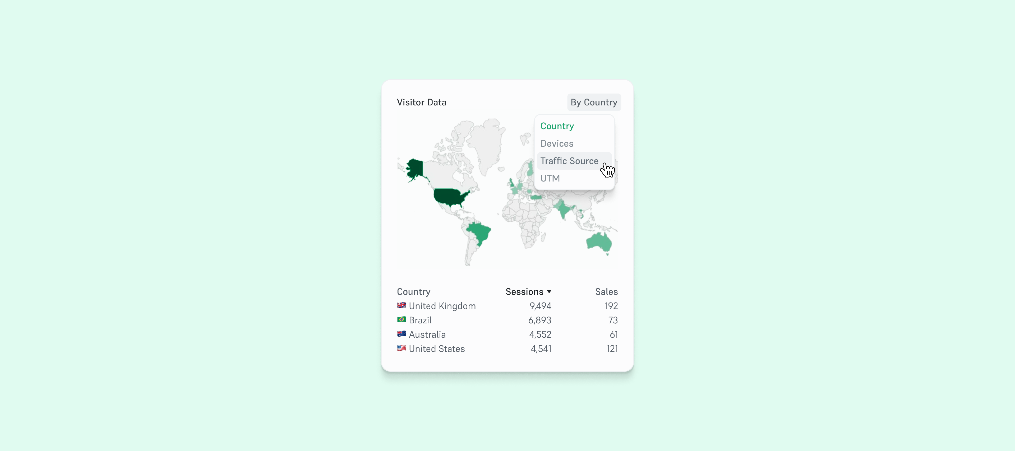
This level of customization extended to choosing metrics and dissecting data by e.g. country, UTM parameters, traffic sources, devices, and other relevant categories. This enhancement catered to individual user requirements, ensuring a more tailored analytical experience.
Mobile Engagement
Our analysis revealed a compelling trend: nearly 40% of users attempted to access the platform via mobile browsers. However, the data also highlighted a critical issue—these users swiftly bounced from the site due to unoptimized layouts that hindered their navigation and interaction with the dashboard.
Understanding the significance of this behavior and its impact on overall user engagement, our focus pivoted to prioritize mobile usability. Our team embarked on a comprehensive redesign, driven by the imperative to deliver a seamless mobile experience.
Central to this effort was the replacement of the traditional endless scrolling with a revolutionary “birds-eye view.” This innovative design overhaul mirrored the familiar tab-switching interface found in mobile browsers. By offering users a clear, concise overview akin to tab navigation, we aimed to rectify the navigational challenges users faced on handheld devices, ultimately fostering a more engaging and intuitive mobile experience.
This strategic shift aimed not only to capture and retain mobile users but also to ensure that the dashboard’s functionality remained consistent and efficient across all platforms.
Measuring the success of these enhancements required meticulous tracking of various design KPIs. Metrics such as increased session duration on the dashboard, the widespread adoption of saved “Views,” frequency of user-initiated section movement, and the utilization rate of customized metric displays served as vital indicators of success.
Additionally, comparing mobile engagement metrics before and after the interface overhaul provided tangible evidence of the enhancements’ positive impact on mobile usability.